I had an opportunity to watch Michael Frye's video on processing a Milky Way photo in Lightroom. It was so excellent I wanted to take notes on his procedure. Much of this echoes his general Lightroom methodology, so I also bought his ebook
Landscapes in Lightroom for more detail.
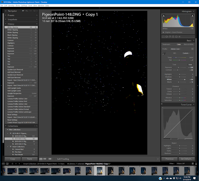
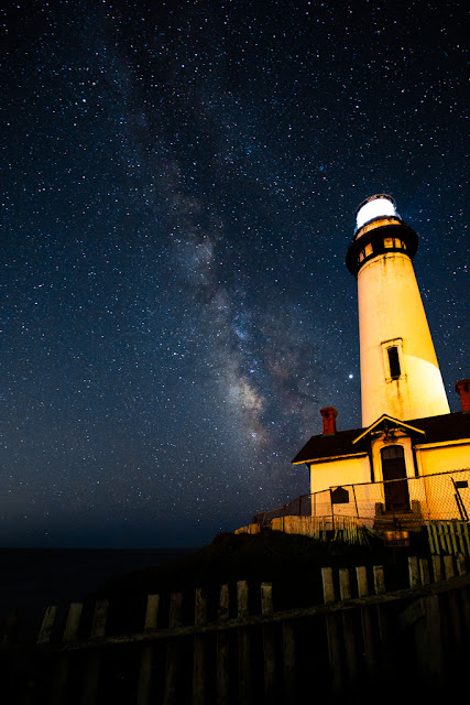
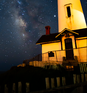
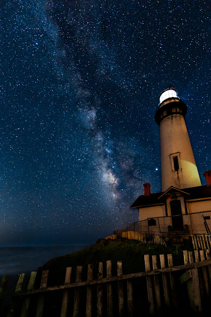
Select a raw image and open it in the Develop module. I'm going to use my PigeonPoint-148 from August 31.
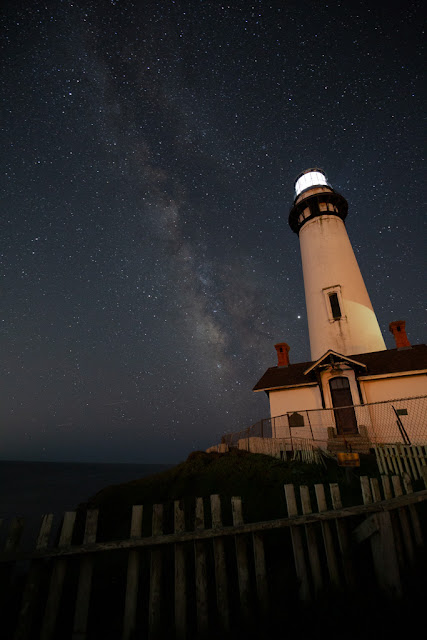 |
Aug 31, 2019 Pigeon Point (#148) as shot.
30 sec, f/4.0 ISO 3200 16mm, Canon 5D MkIII |
Frye has a standard workflow which he uses for processing landscapes. It's explained in detail in his ebook. In the Milky Way tutorial he goes through each step and applies it to his Milky Way example.
In the ebook, Step 1 is to set the default settings (mainly exposure -1.00 and contrast -0.33
Step 1 - Set Camera Profile
Frye describes setting the profile in the Camera Calibration panel of an older version of Lightroom (v 6). His comments:
You may be happy with Adobe Standard. "What you're looking for is the right hues" in the sky. Don't worry about contrast and saturation, they can be adjusted later. He does not recommend the Landscape or Vivid profiles ("too contrasty ... difficulty bringing out enough shadow detail") Milky Way.
In Lightroom 8 the profile is set at the very top of the Basic panel, and the options have changed. The current default for me is "Adobe Color", an option that did not appear to exist in LR 6, or at least is not in Michael's menu. I left it at the default.
Step 2 - Crop and Correct Perspective
By perspective, Frye means for example, "buildings leaning in" and I've certainly got that here. The image in his tutorial does not have this problem and therefore does not go through it, but mine does. In the Transform panel I use Guided mode and set one line on the horizon (temporarily boosting the exposure for easier visibility). A straight line on the left of the building is too extreme so I ease it just a bit. The perspective correction results in cropping of the bottom and right side in particular. This is the result:
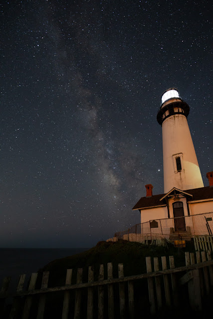 |
| After Step 2 - Perspective Correction and Cropping |
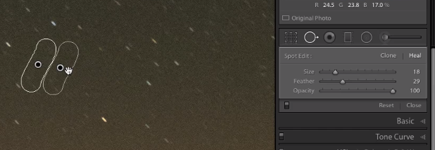
Step 3 - Clone out Aircraft Trails (Dust Spots, Other Retouching)
Frye demonstrates using the Spot Removal tool to remove jet trails. I have a couple so I practice his methods. The video is really good on this.
- Open Spot Removal tool. He most commonly uses Heal mode; try Clone mode when Heal does not give good results.
- Zoom in on the jet trail.
- Set the brush size.
- Using the cursor, draw a line along the trail.
- Press "h" to hide the tool and examine the results. If you want to change it, press h again, then select a different patch source area.
- To draw a straight line instead of freehand, click at one end of the jet trail, then shift-click at the other end.
 |
| Frye video. Spot removal, Heal brush |
Step 4 - White Balance
Frye temporarily nudges up the exposure to help see the colors in the sky. In his case there is a green tinge from "air glow". Mine does not have that problem, but there is a bit of magenta. My as-shot white balance has the Temp at 3950 and the Tint at -2.
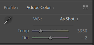 |
| As-Shot: 3950 K, -2 Tint |
I take my tint down to -9, but below that it starts to get a little green.
Step 5 - Optional: Convert the Image to Black and White
This part of Frye's normal workflow does not really apply to Milky Way shots, he just skips it.
Step 6 - Tonal Adjustments
In Frye's general work flow model, this step includes all tonal adjustments using the sliders or point curve. For the Milky Way tutorial he does not use the point curve.
Frye normally starts with exposure at -1 and contrast at -33 because Adobe adds brightness and contrast by default. I notice that this was true as of LR 6 and Adobe's 2012 Process 3, but I'm now running LR Classic 8.4 with Process 5, so I don't know if this still applies. I'm going to assume that it does and, to stay consistent with his tutorial I start there too.
Here are Frye's tonal adjustments steps "for low-contrast images":
- Set the white and black clipping points. He does this by holding Alt (or Option) to make the clipping visible, and moving the White and Black sliders in turn.
 |
| White Clipping: Pressing Alt key while moving the White slider. |
White: The idea is to let the brightest stars clip (i.e. be maximum brightness). In this image, the light on the lighthouse itself also clips.
Black: I set it so that the only pure black areas are shadows. The ocean has a little brightness, as does the green embankment.
 |
| Step 6a: White clipping +70, Black clipping -10 |
- Tweak the Exposure and Contrast.
In the oldest versions of Lightroom, changing the Exposure slider would move the white and black points, and I still thought it worked that way. But it has changed! In his ebook Frye explains that, starting with process 3 in LR 4, the Exposure slider is primarily just moving the midpoint "unless you push it really far". The ebook goes into more detail.
Contrast behavior remains about the same. More contrast means brightening the highlights and darkening the shadows, i.e. making the curve more S-shaped.
Because the lighting on the lighthouse is relatively strong in my image, I determine two completely different settings. For the stars I end at -.90 exposure, contrast +55. But the lighthouse is far too bright and contrasty at that setting. I prefer the lighthouse at exposure -3.50, contrast -100. I decide to set the overall image for the stars (-0.90/+55) and deal with the lighthouse with a brush later.
 |
| Step 6b: Exposure -0.90, Contrast +55 |
- Consider pushing up the Shadow slider a bit.
When Fry does this he retrieves some shadow detail from some mountains. In my case it helps with the fence and embankment, but also considerably brightens the hazy portion of the sky. Reducing it darkens the sky, but loses the color in the sky. In the end, I settle on +25, but may add some more to the fence and embankment with a brush.
 |
| Step 6c: Shadows +25 |
Step 7 - Presence Panel
As of LR Classic 8.4, the Presence panel includes
- Texture
- Clarity
- Dehaze
- Vibrance
- Saturation
Frye's tutorial uses LR6, which is missing "Texture", but he discusses the others.
- Clarity. Clarity increases local contrast, which brightens the stars nicely. But it is very harsh on the lighthouse and cliff. Frye adds +15, but plans to add more later using a brush on the sky.
- Dehaze. Also good for the stars, but harsh on the shadows of the terrestrial features. Again, Frye decides to add this later using a brush on the sky.
- Vibrance. Good for bringing out some of the colors in the Milky Way. Frye puts this at +20.
I found that I liked Clarity +20 and Dehaze +25 for the sky, but it is awful on the lighthouse and shadowy earth features. So I'll follow his lead and apply them later using a brush. I think this is better than adding them globally then trying to reverse them on the land. So no change yet in those.
Vibrance somewhere between +22 and +32 looks fine for both earth and sky, so I set that here, choosing +26.
Step 8 - Adjust Individual Colors with the HSL Panel
In Frye's sample image he is trying to get rid of a green tinge in the sky. He does this by pushing up the Aqua Hue slider, and then easing off the Tint to reduce the amount of purple/magenta. He also tweaked the Temp a bit.
My image also shows some green in the sky, but not as much. Pushing the Aqua Hue is very effective in removing it. I did also move my Tint back up to the original -2, but found that I like reducing the color Temp to 3850 from 3950.
Here is the image now, including the Vibrance adjustment from Step 7 and the color tweaks:
 |
| Steps 7 and 8: Vibrance +26, Aqua Hue +100, Hue -2, Temp 3850 |
Step 9 - Sharpening and Noise Reduction
Frye's standard workflow would do local adjustments (e.g. brushes) first. But for this image he wants to do some NR as part of those brushes, so it makes sense to do the global NR first.
Frye notes that we tend to zoom in too close in judging noise. What final print size are we going for? At 300 dpi, the 22MP 3840x5760 images from my 5D MkIII would print 1:1 at 12.8" x 19.2". But my 4k 2160 x 3840 32" monitor (screen is 28" wide) is about 137 dpi, and the same 1:1 image would be 28" x 42". Now imagine that you've printed it at that size and are scrutinizing it from 20" away -- it's just unrealistic. Frye likes using 1:2 for looking at sharpening and NR.
I assumed that we would jump right into the using the Luminance slider to adjust noise. But Frye has a better idea. He believes the most effective NR in Lightroom is in the Masking slider under Sharpening.
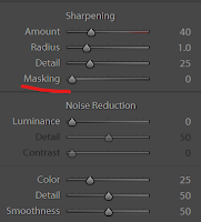 |
| The Masking slider is under Sharpening in the Detail panel. |
First of all, notice that
default sharpening of 40 is being applied to the whole image. The Masking slider controls "Edge Masking" and allows us to sharpen only edges, not the smooth textured areas. It's vital to understand that the mask is not
adding sharpening, rather it
removes sharpening from the "smooth" parts of the image. In a noisy image like this one, sharpening is accentuating noise. So removing some sharpening is in effect noise reduction.
Hold down the Alt (or Option) key while moving the slider to see the mask. It starts out at zero all-white. Then moving to the right, the detected smoother areas become black or gray. The white areas will be sharpened, the black areas are not sharpened
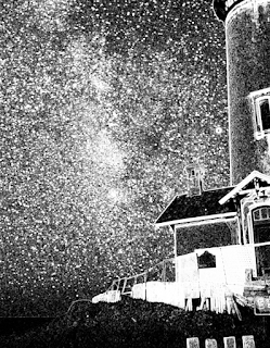 |
| Masking at about 42. Textured areas in the tower will get some sharpening. |
The idea is to avoid sharpening smooth areas, like sky. In Frye's example, he pushes the mask all the way to 100.
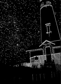 |
| Masking = 100. Edges of the roof, chimney and foreground picket fence have disappeared and will not be sharpened. |
But in my image, 100 causes some of the edges to disappear. They would therefore not be sharpened. I need to bring it down so that the roof line, chimney and picket fence get some sharpening.
 |
| Masking = 85. Roof and picket fence get some sharpening |
In the end I used 80 rather than 85, in order to pick up more sharpening in the chimney.
The Detail slider controls sharpening of fine detail which, in this image, is mostly noise. The Adobe default value is 25, but Frye's default is 50. He brings his down to 35; I just leave mine at 25.
Under Noise Reduction, the Luminance slider would allow us to get rid of virtually all noise, at the expense of turning the image to (Frye's words) "mush".
 |
| Noise Reduction: Luminance = 100. "Mush" |
Because of the high ISO (3200), there is a lot of luminance noise. It is especially noticeable in dark areas such as the sky and the shadows. At Luminance = 10 we see a meaningful improvement in the sky, but without losing all the texture. Since so much of the "light" in the sky is noise, this noticeably darkens the sky, increasing the relative contrast with the stars.
For color noise, the default setting of 25 is fine.
 |
| Step 9: Masking = 80, Luminance = 10 |
Frye's sample image has water, and he notes that he will be going back to remove more noise there using a brush -- it's ok for the water to be more smooth. I suppose the same argument could be made for the sky ...
Step 10 - Lens Corrections
My Canon 16-35 EF shows quite a lot of
barrel distortion at 16mm, which is corrected by enabling the profile correction. Given the strong lines of the lighthouse, this is a big win for the image.
The profile corrects both the distortion and the vignetting of the lens. I like retrieving more brightness at the top and bottom, but it's not an improvement on the right and left. In particular it reveals a lot of sky brightness on the left, evidently from the city of Santa Cruz.
 |
| Step 10: Lens profile corrections for distortion and vignetting |
Chromatic aberration and fringing is not really an issue for this image -- Frye spends quite a bit of time on it in his tutorial and demonstrates various methods, including how to fix coma.
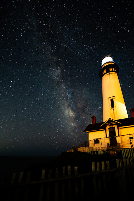
Step 11 - Adjustment Brush
We've saved up several adjustments for the brush:
- Recall that I prefer the lighthouse at exposure -3.50, contrast -100, but set the overall image for the stars at -0.90/+55. I'll need to take down the lighthouse exposure and contrast quite a bit. The light on the lighthouse needs to be taken down enough so the glazing between the panels shows.
- The color of the lighthouse is too strong and too ugly. It may need further adjustment after the exposure.
- Depending on which monitor I use, the ocean and the embankment may be completely lost. In a print they will very likely be black. So this needs some lightening.
- I'd like to add Clarity +20 and Dehaze +25 for the sky.
- Local noise reduction? Maybe on the water.
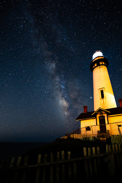
Here it as after a first pass over all these items, using 11 separate adjustments brushes.
 |
| Step 11: Adjustment Brushes |
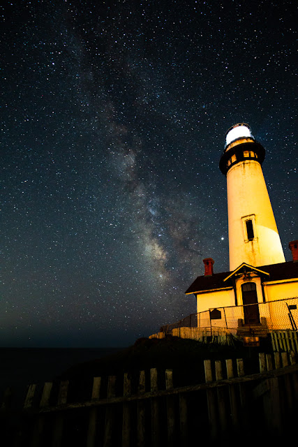
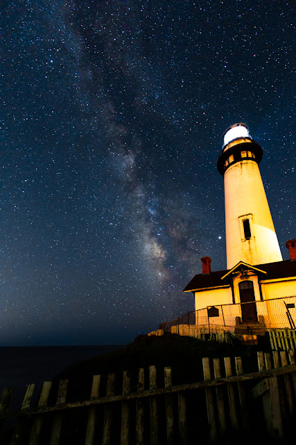
And again after going back to tweak the global HSL (the sky was too aqua), as well the main lighthouse brush (it still had too much orange color on some monitors):
 |
| Tweaks to HSL and lighthouse |
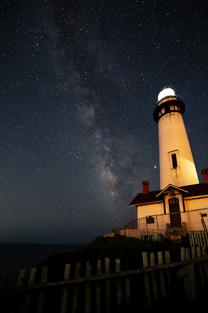
Well, it's hard to see much difference between the two.
Step 12 - Vignetting
This step is in Frye's Lightroom book; he does not mention it in the Milky Way video so I'm just including it for reference to his full workflow. The Effects panel includes the Vignetting controls. As I noted earlier, my lens in this case actually quite a lot of natural vignetting. This was useful on the sides of this particular image, but I was less pleased with the effect on the top and bottom. Compare the images for Step 9 and Step 10.
I could have added vignetting by simply dialing down the vignetting correction in the Lens Profile correction stage and accepting the natural result. Or I could have used the Effects panel.
In this image, instead of doing either of those I chose to add back a darkening brush over the city light bleed on the left. Some darkening on the right of the lighthouse might also be nice, but I haven't done it yet.


great
ReplyDeletevideo on processing a Milky Way photo in Lightroom
ReplyDeleteImage Dehazing Projects